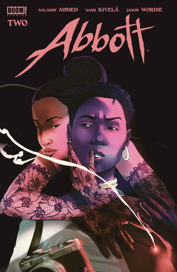
Abbott #2
Posted on March 3, 2018 by John Elrod II in Abbott // 0 Comments
Previously: Abbott #1
Coming into Abbott‘s first issue in January, we knew a few things about the series: it was going to be a period piece, it was going to take place in Detroit, and it was going to contain some level of occult themes. That first issue was heavy on 1972 Detroit, but it was a little light on the occult stuff. Well, guess what this second issue is loaded with.
I feel like someone took everything I like in a comic, plugged it all into some kind of algorithm, and it used machine learning to spit out this series and deliver it to me personally. I read Abbott and find myself repeatedly saying to myself “Oh, I love when a comic does this!” Of course it’s only two issues, so I’m trying to temper my expectations for the future of this series, but it’s been all of my jam so far.
Every comic contains a story being told in equal parts by its script and its art-one hopes, at least; that’s the beauty of comics. But, sometimes, a story contains certain elements which allow its art and script to complement each other to an even greater effect. Given that it is about a journalist interacting with some occult, supernatural phenomena, Abbott is one such story. To wit, this series is able to present the dry, normal world of Elena Abbott’s life in a fairly pedestrian way. Yes, she’s an investigative reporter, so her life is interesting, but we’re still just watching her go through her days. But then that switch can be turned on, right? When there’s something strange in the neighborhood, the color palette shifts and the perspective changes; the entire book becomes something different. Abbott is far from the first series to exercise the ability to do this; just from a quick check of my memory: Black Magick does this same sort of thing, and it’s one of the things I loved about the series Dream Police, to name a couple examples. What matters, though, is how well what you’re doing works, and what illustrator Sami Kivelä and colorist Jason Wordie are doing works fantastically.
What’s more, I love the staging of this series; how the characters are placed within the scenes on the page. Just as much as color, staging can affect the emotion and temperature of a scene. You can add drama, you can add comedy, you can add suspense: all from how you stage your scene. This is something Sami Kivelä seems to understand really well and excels at. If you’ve not read Beautiful Canvas, which Sami Kivelä also illustrated, I highly suggest you do because it’s very good and his art there puts this same thing on full display.
In both of its issue thus far, this series has used Elena Abbott’s career as a journalist liberally, and I love it. I love when comics-and movies, too, but it’s typically more effective in written media-use other forms of media to enhance their story. We saw this recently in Black [AF]: America’s Sweetheart where the story heavily used social media, but there are myriad examples of this. In its first issue, Abbott even used music within its script. On the whole, though, it’s the use of Elena Abbott’s articles that I love. As much as these first two issues have been about their titular character, they’ve also been about the city of Detroit, and the city’s story is best read through the prism of Elena’s journalistic eye; that’s what we’re getting.
Another thing this series is doing, which I love to see, is its heavy use of establishing shots with time stamps. I understand why a lot of comics eschew these; they slow down the narrative and take up valuable panel inches. I get it, but I love seeing these in a comic. I just feel like it helps complete the visual story; it puts me where I need to be as a reader. The added value is, when a moment occurs where I’m supposed to be disoriented as a reader, you can remove those and instantly make me feel lost, especially in a story where it feels like the goal is to juxtapose Elena’s normal life with the disruptive force of the occult.
All of those more-visual elements help to enhance the intriguing narrative unfolding underneath. The story Saladin Ahmed is writing seems to be unfolding at a nice, even pace; like a flower softly blooming across the opening days of spring. We’re meeting new characters and learning bits and pieces about Elena’s past, but not so much that it’s overwhelming or confusing to follow. Plus, we’re getting those occult moments; these scenes that kind of feel like an early ’80s horror movie where we had computers but there was still a feeling we could walk into an antique store and accidentally buy a mogwai. It’s a feeling of unease where you know what you should expect, but it doesn’t change what you do expect.
I don’t know, guys; I’m just really enjoying this series. Just go with me here, okay?
Abbott #2 Review Score
-
Plot – 9/109/10
-
Dialogue – 9/109/10
-
Art – 10/1010/10
-
Cover – 9.5/109.5/10
Abbott #2 – Chapter Two: "Do Right Woman"
Writer: Saladin Ahmed | Illustrator: Sami Kivelä | Color: Jason Wordie | Letters: Jim Campbell | Cover: Taj Tenfold | Designer: Michelle Ankley | Editor: Eric Harburn | Associate Editor: Chris Rosa | Publisher: Boom! Studios


