The Magic Order #2
Posted on July 24, 2018 by John Elrod II in The Magic Order // 0 Comments
Previously: The Magic Order #1.
We’re not just going further down the rabbit hole here; we’re traveling through an underground rabbit transit system that somehow leads us all into one magician’s hat, and his name is Mark Millar.
The concept of a magical assassin is frightening. In the previous issue, we saw this theory tested and proven. Here we see that conclusion not only reaffirmed but reaffirmed multiple times over. For a series all about magic, The Magic Order sure does seem to adhere to the scientific method quite well.
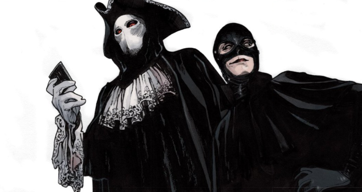
Yes, this issue does two very specific things. It does both of these things in different ways, and it does both of them extremely well. The bigger of these two specific things is strengthening its villains even further. Last month, we saw Madame Albany and her mystery assassin partner do a bit of murder; just a dabble. In this issue? We’ve got assassination aplenty, and it’s all really disturbing. I mean, the series did start with a possessed kid murdering his parents, so yeah, we’ve seen disturbing. But the stuff we see here is less blunt and more torturous and psychologically damaging. The assassin, who we now know to be called The Venetian, is diabolical; and they’re magical, so they can literally kill you however they want.
They’re not killing you, though, and they’re not killing me; they’re killing other magicians. Of course, this is the most important factor in strengthening your villain: establish your heroes as powerful beings. This is “The Magic Order”. The Moonstone family has protected the Earth for a thousand years. Their home castle is located in a painting all Gallifrey Falls No More style and can only be accessed like you’re going through Platform 9 3/4. These are powerful people; each issue has shown them to be more and more powerful, and The Venetian is still able to kill them like it’s nothing. You should be scared. I am.
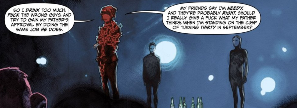
The other thing The Magic Order #2 does well is build the character of Cordelia Moonstone. We spend a lot of page real estate seeing what she was like from an early age-a very early age-and precocious doesn’t even come close to covering it. To break this down just a little further, there are two things that are terrific about the way the Cordelia character’s backstory is handled here; well, the whole thing is good, but I want to highlight these two parts specifically.
The first is in how fun it is. It’s lighthearted, and funny, in a dangerous way, though. Her life started in a very messed up way, she has never had a great relationship with her family (her father, in particular), and we know from seeing adult Cordelia that she’s clearly not in a great mental place. Still, though, watching how Millar has written child Cordelia to be dealing with these serious life problems in this entertaining and intrepid way makes you forget all her trauma and just imagine what other adventures she had along the way. I could see another six-issue limited series of just child Cordelia getting into and out of various predicaments.
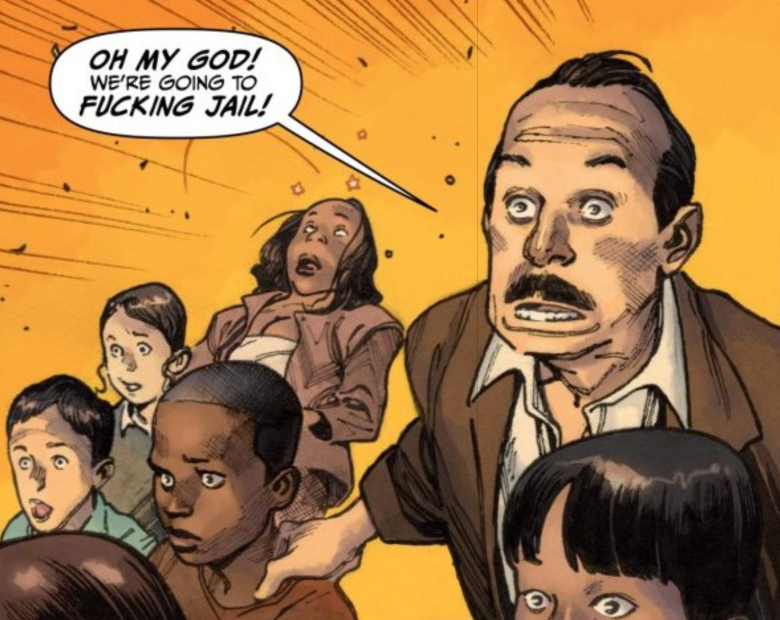
The second actually leads me into the artwork here. The combined work from Olivier Coipel and Dave Stewart has been exemplary through these first two issues, and I have to pay particular attention to the facial expressions throughout this issue; most of them in response to something Cordelia says or does. It’s hilarious. There can be a half-dozen faces in one panel, and they’re all uniquely reacting to a situation in a way that lets you know exactly what they are all thinking.
I’m really loving everything about this series so far, and I guess the overall takeaway from the total package is just how cinematic it feels. Comics don’t have to feel cinematic; some amazing comics are as good as they are specifically because they feel like they could only exist on the page. That’s not a negative thing; it’s all in how the story is told. I’ll give you an example: Beautiful Canvas. I loved Beautiful Canvas, and it works so well on the page; but it’s not something I read and thought it should (or could) be a movie. Sometimes, though, a creative team comes together and combines plot with illustration in such a way that just leaps out at you. An example of this would be literally anything Greg Rucka writes; the dude writes in HD. The Magic Order is one of those titles (and, obviously, Mark Millar has many titles that feel this way).
The upshot here is the marriage between Millarworld and Netflix continues to be a fantastic union. Could we just be in the honeymoon(stone) period? Sure, but I choose to enjoy it while it lasts, and that means we at least have four more issues of The Magic Order to enjoy, and I have a feeling I’m going to do just that.
The Magic Order #2 Review Score
-
Plot – 9/109/10
-
Dialogue – 9.5/109.5/10
-
Art – 10/1010/10
-
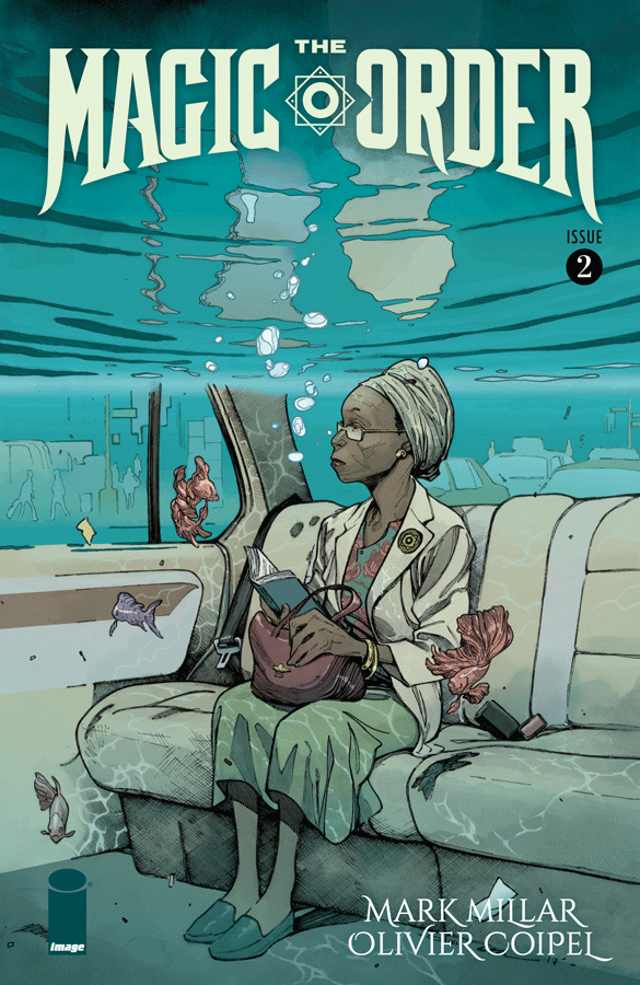
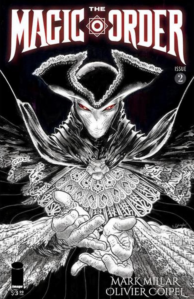
Cover – 10/1010/10
The Magic Order #2 (of 6)
Writer: Mark Millar | Artist: Olivier Coipel | Colorist: Dave Stewart | Letterer: Peter Doherty | Design and Production: Melina Mikulic | Editor: Rachael Fulton | Covers A & B: Olivier Coipel with Dave Stewart | Cover C: Rafael Grampa | Publisher: Image Comics

