The Magic Order #3
Posted on August 23, 2018 by John Elrod II in The Magic Order // 0 Comments
Previously: The Magic Order #2.
Falling directly in the middle of The Magic Order‘s six-issue limited run, this issue serves as a pivotal moment in the plot of this series, but as momentous as the writing here is, it is somehow outshone by a phenomenal showcase put on by the artwork.

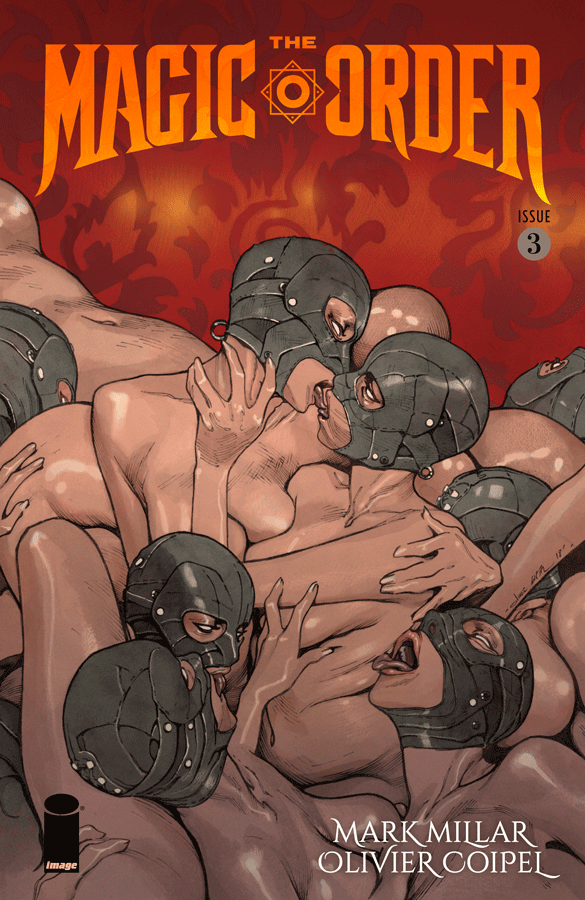
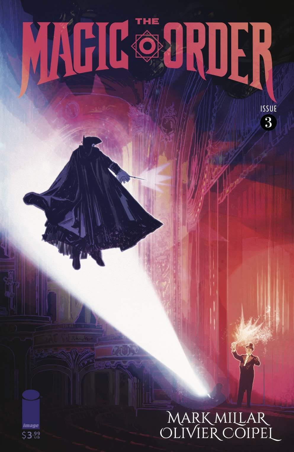
Every cover has been fantastic, but I believe this is my favorite cover of the series so far, and the alternate cover by Tommy Lee Edwards is my favorite alternate cover so far.
I’ve talked ad infinitum about how well this series has defined the threat of its villains; not only through showing their strengths, but also by illustrating just how powerful the series’ protagonists are… only to have the villains kill them off. Even still, so far, each successive issue has managed to up the ante. Without spoiling anything, I’m going to presume this issue is the last of that run because I do not believe the villains can be made any more powerful after the events we see here. We have reached a boiling point, and that makes sense, given this is the third issue in a six-issue series. It’s time to start coming down the other side of the mountain, unless we’re about to watch the bad guys win, which is honestly something I would not yet rule out for The Magic Order, but we’ll see.
I continue to love both Madame Albany and The Venetian; they are exceptionally crafted characters, for what they need to be. In just three issues, we’ve got The Venetian as this mysterious stranger slaughtering everyone with ease and Madame Albany seeming every bit of the mad queen, a la Cersei Lannister. They are both dangerous and provocative; you want to be scared of them, and you should be, but you also can’t help but find them immensely cool.
Beyond the villains, we get more character development of another of the Moonstone kids. Last month it was Cordelia, and this month it’s Gabriel. Gabriel is sort of the Moonstone family’s proverbial prodigal son, in that he left the order behind and does not come to the cookouts anymore. Here, we get some terrific dramatic moments in the telling of what it was that happened in Gabriel’s past to cause him to leave. You know the thing about prodigal sons, though, right? Yeah, next issue is going to be crazy.
So there’s plenty of plot here, and it’s important plot; no filler whatsoever, but even still, the artwork from Olivier Coipel and Dave Stewart is so brilliant throughout this issue as to truly overshadow some significant moments in the story. I mean, I say “overshadow”, but that’s just to say the story of this issue allows this art team to pull out every trick they have, which only serves to enhance the story that much more.
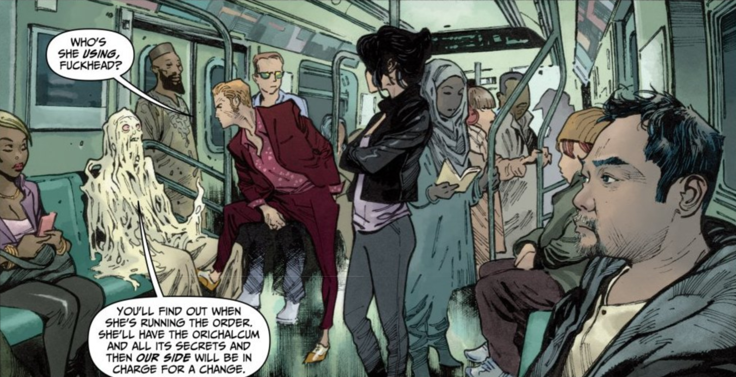
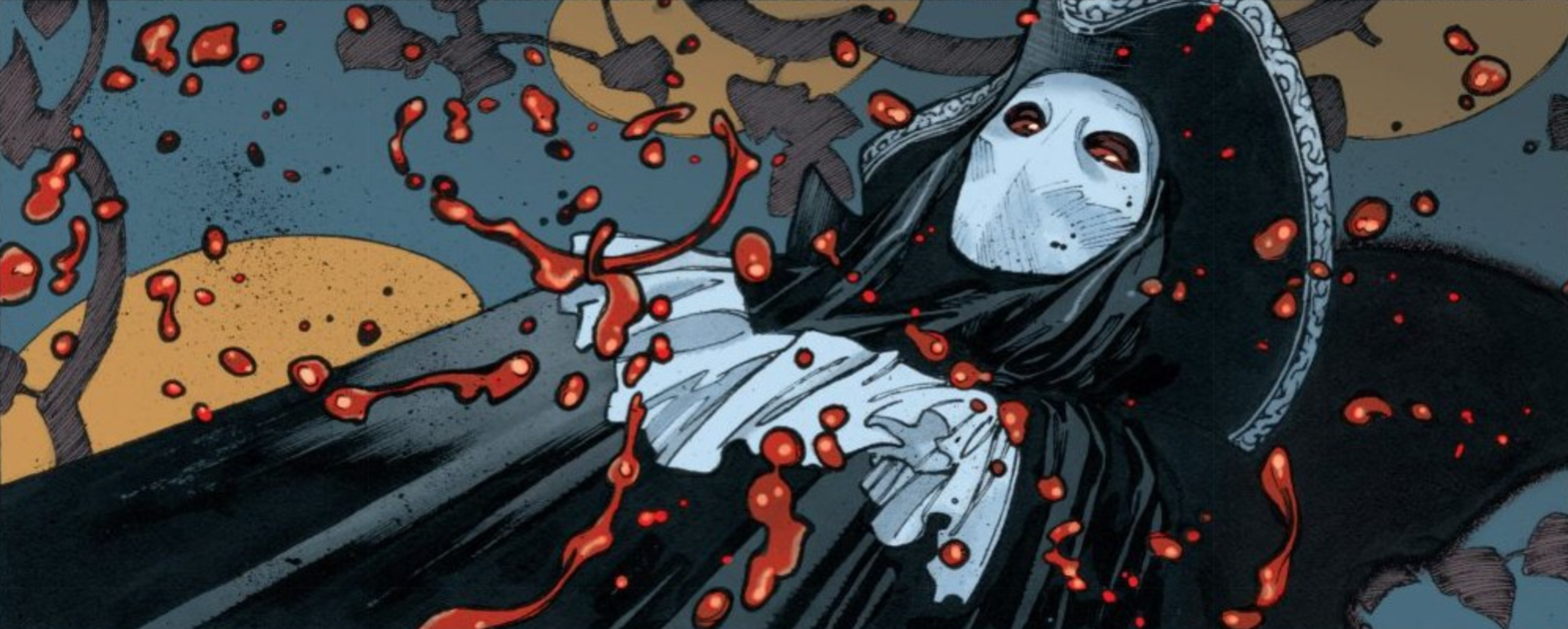
Each issue so far has had terrific artwork. Most notably, the character designs are flawless, and I particularly enjoyed the facial expressions throughout last month’s issue #2. However, this issue has everything: cityscapes, facial closeups, sprawling crowds, detailed action shots, various visceral mutilation, and dramatic panels without any dialogue. It has everything, and this art team nails it all, from capturing the emotion of a strained conversation, to placing a melting man in a busy subway, to the operatic presentation of The Venetian’s heinous acts: it’s all just so perfect.
What I’m enjoying most about this series is that it’s legitimately frightening but on an approachable level. It feels sort of like an old Don Bluth film; like All Dogs Go To Heaven or Rock-A-Doodle, you know? There are serious Hellraiser-type, gory moments in this series, but it still has a commercial shine on it. You know what I’m really thinking of? You remember the animated movie We’re Back! A Dinosaur’s Story? Surprisingly not directed by Don Bluth, but it is certainly Bluthian. It’s a movie full of singing and dancing dinosaurs, right? But toward the end, the movie’s villain is attacked by his own crows, and they eat his entire body, save for a fake eye he had. That’s fucked up, and it scared the shit out of me when I was a kid. That’s sort of the vibe I’m getting with The Magic Order. Yeah, it’s more consistently “adult” fare, but it’s still an approachable story most of the time… and then someone gets absolutely eviscerated… by MAGIC. It’s a good blend; I dig it, and I always have.
I’m so invested in this story, and I love knowing it’s six issues because I know everything we get from here on out is going to be on this same level. Nothing is going to be extraneous in these final three issues; it’s all going to matter.
The Magic Order #3 Review Score
-
Plot – 9/109/10
-
Dialogue – 8.5/108.5/10
-
Art – 10/1010/10
-
Cover – 10/1010/10
The Magic Order #3 (of 6)
Writer: Mark Millar | Artist: Olivier Coipel | Colorist: Dave Stewart | Letterer: Peter Doherty | Design and Production: Melina Mikulic | Editor: Rachael Fulton | Covers A & B: Olivier Coipel with Dave Stewart | Cover C: Tommy Lee Edwards | Publisher: Image Comics


